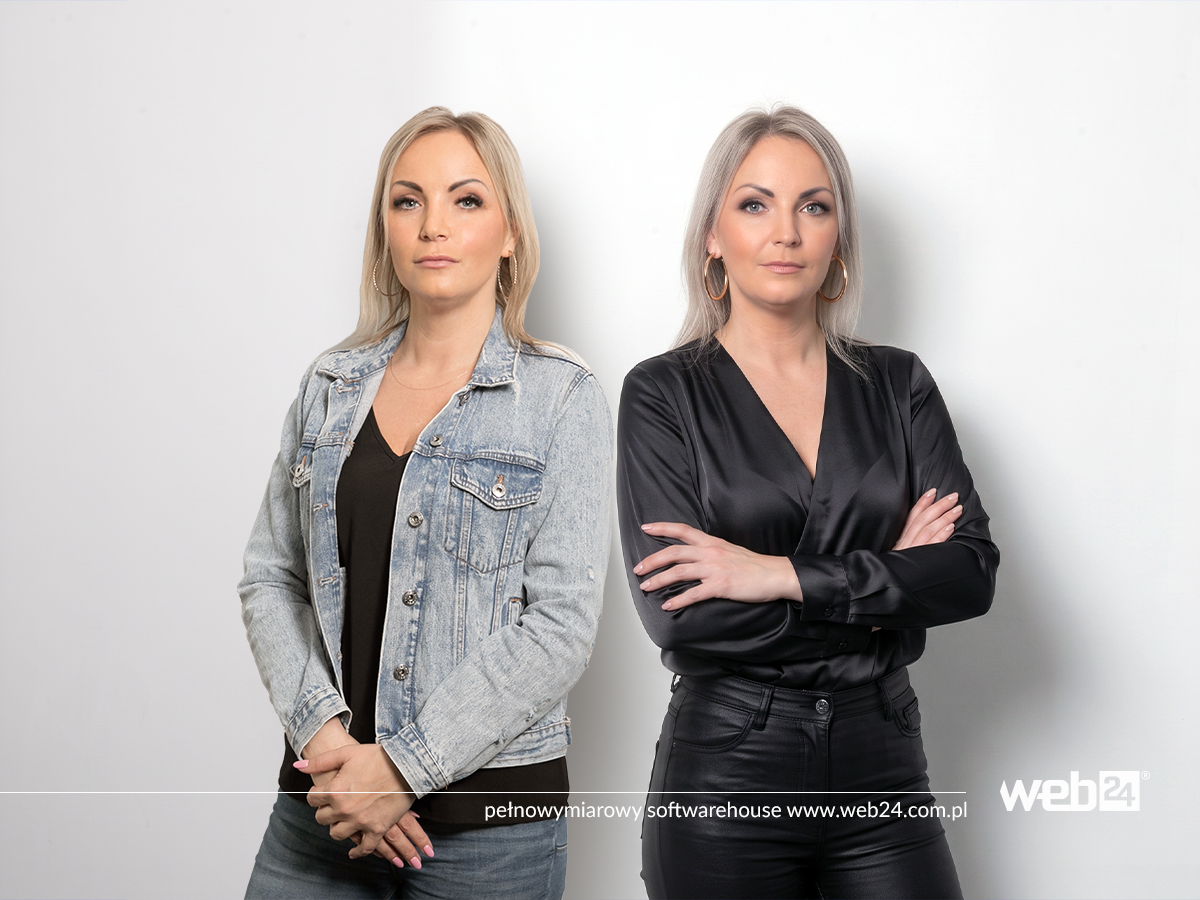
Imagine two photos. In the first, a smiling woman sits in a perfectly furnished office. The light is soft, the colors are perfectly matched, and every detail of the composition is carefully considered. Everything looks like it came from a professional stock photo library.
In the second, someone has captured an employee at their desk. A coffee mug is visible in the background, a project is open on the screen, and the person looks focused. The shot isn’t perfect, the lighting could be better, and the composition wouldn’t win every photography contest.
Which photo would make you stop scrolling?
There’s no single answer. But there’s a reason the second one might grab your attention more effectively. It doesn’t look like yet another image created to sell something. It shows a situation we can imagine. A person we might meet. A moment that could really have happened.
In visual communication, we often focus on whether a graphic is attractive, modern, and consistent with the brand identity. That matters, but it’s not the whole story. An image shouldn’t just look good. It should also communicate something, spark interest, or help the audience understand who they’re dealing with.
An internet full of perfection. Why is it getting harder to stand out?
For years, professional visual communication has been associated with high-quality photos, carefully composed shots, and polished design. Brands invested in photo shoots, stock image libraries, advertising graphics, and consistent promotional materials. These things still matter. The problem starts when every brand uses similar visual tools.
A smiling team around a conference table. A hand holding a smartphone. An entrepreneur gazing into the distance through an office’s glass wall. Two people shaking hands. Every photo is competent, attractive, and technically sound. At the same time, it’s hard to associate any one of them with a specific company.
When we see similar images on dozens of websites and in hundreds of ads, they stop being distinctive. We don’t even need to consciously recognize a repeated photo. It’s enough for it to start looking like something we’ve seen many times before.
Nielsen Norman Group points out that users can ignore decorative photos that don’t provide any specific information. Photos of real people, products, and situations related to a page’s subject, on the other hand, can attract attention because they help people understand the content. So it’s not just about whether an image is appealing. It’s also about whether it means something to the audience.
That’s an important distinction. A photo can be beautiful and still say nothing about the company, its people, or its offering.
Authenticity doesn’t mean abandoning aesthetics
Let’s clear up one misconception right away. Authentic visual communication doesn’t mean publishing random, unclear photos and giving up on professional design.
It’s not about a company no longer caring about the quality of its materials. It’s about quality not being the only criterion for choosing them.
A photo can be well-composed, properly lit, and consistent with the visual identity while still showing real people in real situations. You can create attractive material without building an artificial world where every employee is always smiling, every desk is perfectly tidy, and every conversation looks like a shot from an ad.
Authenticity is, above all, about aligning the image with the brand’s reality. If a company is built on relationships, experience, and direct contact with customers, photos of its team can say more than yet another illustration of anonymous professionals.
If it sells a product, people may want to see what it really looks like, how it’s used, and what details it has. If it provides services, photos showing people, the workplace, and how the work is done may be helpful. If it develops software, a photo of the team working on a project may be more informative than a picture of an unfamiliar person looking at a computer screen.
Not every brand needs to show everything. But it should know what it wants to reveal to its audience and why that particular image matters.
What draws our attention to an ordinary photo?
1. We recognize situations from everyday life
People don’t browse the internet just to admire attractive compositions. They’re looking for information, solutions, inspiration, entertainment, and connection with others. An image connected to their own experience may interest them more than a beautiful but abstract scene.
An ordinary photo of someone getting ready for a meeting, packing an order, or talking with a customer shows a specific situation. The viewer can easily understand what’s happening and relate it to their own life.
That doesn’t mean every familiar image will automatically grab someone’s attention. It also needs to fit the context, the audience’s needs, and the content it accompanies.
2. A face and an emotion can say more than decoration
People pay attention to faces, expressions, and interactions. Sometimes a small detail—concentration, surprise, or the relief of solving a problem—conveys more information than an elaborate graphic.
But what matters is what the photo actually shows. An unnaturally broad smile doesn’t have to inspire trust just because it’s a smile. Likewise, a serious expression doesn’t always signal professionalism.
A study published in the “Journal of Interactive Advertising” examined, among other things, how facial expressions and photographic style affect perceived brand authenticity. The findings indicated that both facial expression and a more spontaneous feel to a photo can influence perceptions of credibility. This isn’t a universal formula for effective advertising, but it’s a good reason to choose carefully how people are portrayed.
3. An image can feel less staged
A perfectly polished advertising photo often communicates that someone prepared it specifically to persuade the audience to choose a particular product or service. That’s not a bad thing in itself. Advertising has a specific purpose, after all.
The problem arises when an image is so heavily staged that it starts to suggest a world that doesn’t exist. Every customer is delighted, every collaboration goes smoothly, and every solution works without the slightest problem.
An ordinary photo can feel more natural because it doesn’t try to pretend reality is perfect. It shows a specific moment instead of suggesting that everything is always flawless.
It’s a subtle but important difference between showing a brand and putting it on stage.
Are audiences already tired of stock photos?
It would be inaccurate to say that all stock photos are ineffective. Professional photography can be very useful, especially when you need to show a subject that is difficult to photograph, maintain a particular style, or quickly prepare campaign materials.
The real problem is using images uncritically when they add nothing distinctive.
If several companies in the same industry publish photos of similar people in almost identical offices, it is hard to build a recognizable identity with them. The audience sees a general image of professionalism, but learns nothing about what sets one organization apart from another.
That’s why it’s worth asking a few questions before choosing a photo:
-
Does this image fit what we actually do?
-
Does it help people understand the content, product, or service?
-
Could ten other companies use it unchanged?
-
Does it show something distinctive about our brand?
-
Does it engage the right audience?
If a photo could fit almost any company, it probably isn’t making full use of its communicative potential.
What about AI-generated images?
Artificial intelligence has made it easier to create polished images. You can generate a scene that matches your brand’s colors, depicts almost any situation, and doesn’t require organizing a photo shoot.
That’s a real benefit. AI can help develop a concept, create an illustration for an abstract subject, test different visual directions, or produce materials for which it’s difficult to find suitable photos.
However, it’s best not to treat a generator as an automatic answer to every communication challenge.
A 2026 study published by Nielsen Norman Group examined how participants evaluated websites featuring AI-generated images and stock photos. In the scenario studied, when participants didn’t know where the image came from, AI-generated graphics did not automatically result in lower ratings for a company’s credibility, professionalism, or authenticity. This is an important caveat: it would therefore be inaccurate to claim that every AI-generated image is inherently less credible.
At the same time, the results of a limited study shouldn’t be applied directly to every industry, format, and situation. Audiences may respond differently to a conceptual illustration, an image of an employee, or a photo of an actual product they are considering buying.
So the most important question isn’t, “Was this image created using AI?” It’s more like, “Does this image communicate what we want to show honestly and effectively?”
If a company wants to show its real team, an event, or a completed project, a generated image cannot replace documentation of reality. It may work well as an illustration, however, as long as it’s appropriate and its use doesn’t mislead the audience.
Why are brands sometimes afraid of ordinary photos?
Because an ordinary photo is harder to control than a perfect creative asset.
A photo of a real office might show a messy desk. An employee might not look like an advertising model. The background might include a detail that wasn’t anticipated in the design. The real process can be less spectacular than its advertising version.
That’s why companies often try to smooth out every aspect of their communications. They choose safe images, remove imperfections, and aim for visual consistency.
Consistency itself is valuable. The problem starts when it makes a brand anonymous.
A company’s image doesn’t have to be perfect down to the last pixel. It should be considered, credible, and consistent. Well-designed communication can have character, show people, and allow for a natural feel without losing its professionalism.
Sometimes all it takes is changing the question you ask when choosing a photo. Instead of “Which photo looks the best?” it’s worth asking, “Which one best shows what we want the audience to understand and remember?”
How can you use authenticity in your company’s communications?
You don’t have to organize a major photo shoot right away. In many cases, it’s worth starting by taking a look at the materials your company already has.
Show real people
If people are an important part of your offering, show them in a natural context. That could be employees at work, specialists discussing a project, people preparing a job, or a team working together on a task.
Not every shot has to be spontaneous in the literal sense. You can plan photos and take care with lighting and composition while avoiding stiff poses and situations unrelated to everyday work.
Document the process, not just the end result
The finished product or completed project matters, but the journey that led to it can be interesting too. A photo of an installation, a glimpse of the team at work, a material sample, or a detail of a solution can show what lies behind the result.
These images can provide concrete information instead of merely setting a mood. They can also help build communications around the company’s real expertise.
Let images tell different stories
If every post uses the same type of graphic, the audience quickly gets used to the format. It’s worth mixing things up: professional product photos, images from everyday work, details, illustrations, screenshots, and informational graphics.
This isn’t about variety for its own sake. Each format should serve the purpose of the post. One image might work for presenting a product, another for showing the team, and yet another for explaining a complex service.
Don’t fake spontaneity
Authenticity can easily become another advertising convention. If a brand starts staging “accidental” moments just to look natural, the result can be just as artificial as a classic stock photo.
There’s no need to force imperfections. Just show things that really happen, and don’t edit them to the point where they lose their character.
How can you tell if an ordinary photo works better?
Instead of relying solely on intuition, it’s worth comparing different versions of your materials.
Prepare two versions of the creative: one using a highly polished photo, the other using a natural photo from a real situation. Keep the message, text, format, and target audience as similar as possible. Then compare the results.
Depending on the campaign’s goal, these might include:
-
attention retention and video views;
-
engagement, such as comments, shares, or saves;
-
website visits;
-
inquiries, sign-ups, or sales.
Likes shouldn’t be equated with business effectiveness. A photo may attract attention without prompting action. Another may get fewer reactions while doing a better job of supporting sales. Results need to be interpreted in the context of the post’s goal.
It is also worth remembering that effectiveness depends on more than the photograph itself. The copy, offer, audience, publication channel, exposure time, and presentation all matter. So if we want to draw reliable conclusions, our comparison should limit the number of variables.
Don’t choose between beauty and truth
Professionalism and authenticity don’t have to compete. A good photograph can be attractive and still feel genuine. A good graphic can be polished while showing something distinctive about the brand. The problem isn’t perfection itself, but perfection without meaning.
In visual communication, it’s worth thinking not only about how an image looks, but also about what it contributes. Does it show the product? Explain the service? Introduce a person? Build trust? Help people imagine what it would be like to work together? Or is it merely decoration that could appear anywhere?
Sometimes the most effective image isn’t the one that looks best in a designer’s portfolio. It’s the one that helps the audience see something important and recognize their own experience in it.
People don’t stop only for beautiful images. They also stop when they see something in them that matters to them.
